Jonathon Thomason — Senior Product Designer — Enterprise Systems & AI Workflows
I design complex platforms end-to-end—
turning fragmented tools into clear, scalable systems.
AI · Automation · BizOps · E-commerce
Built for accessibility, clarity, and measurable business outcomes.
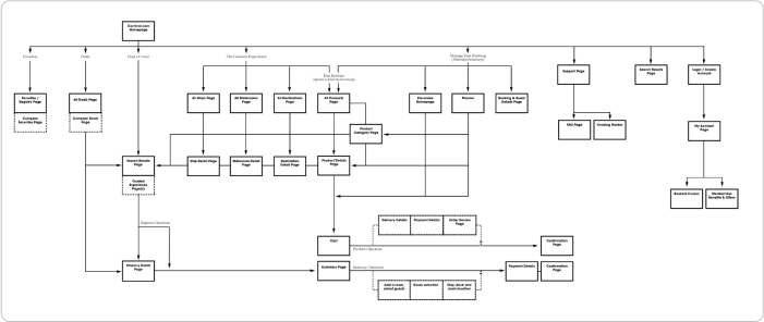
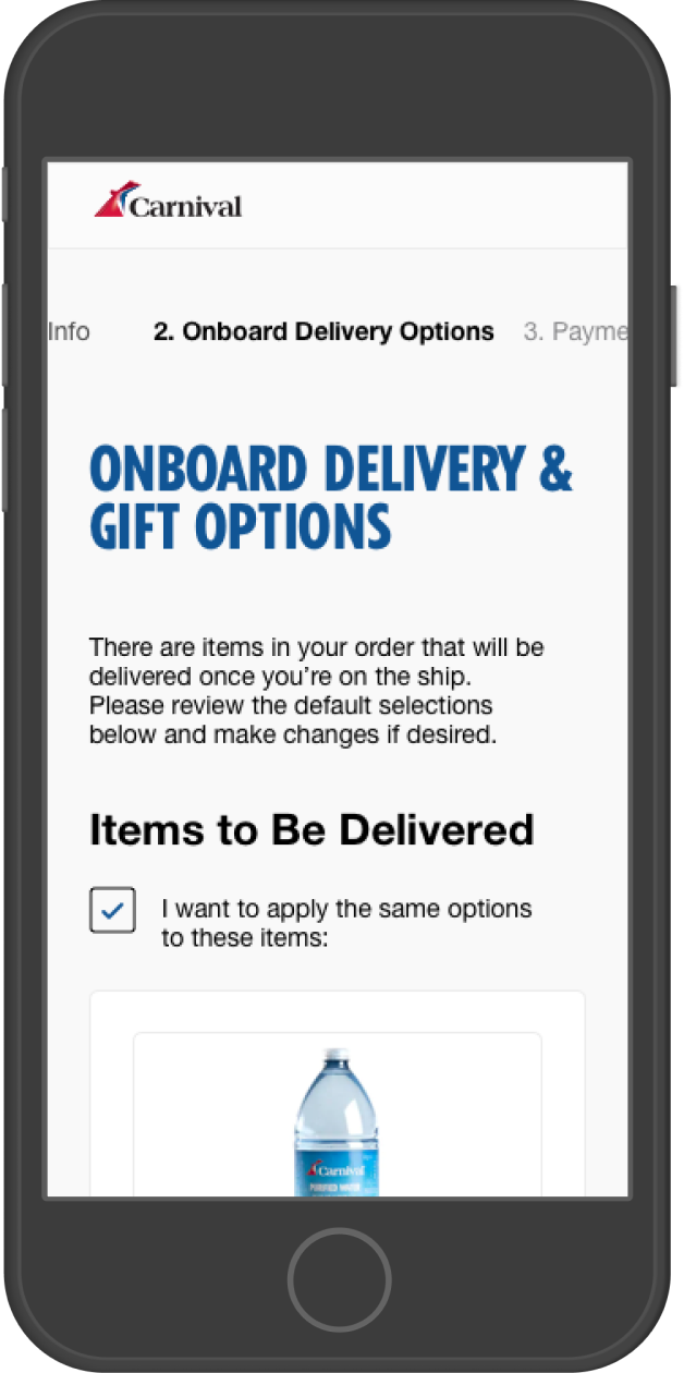
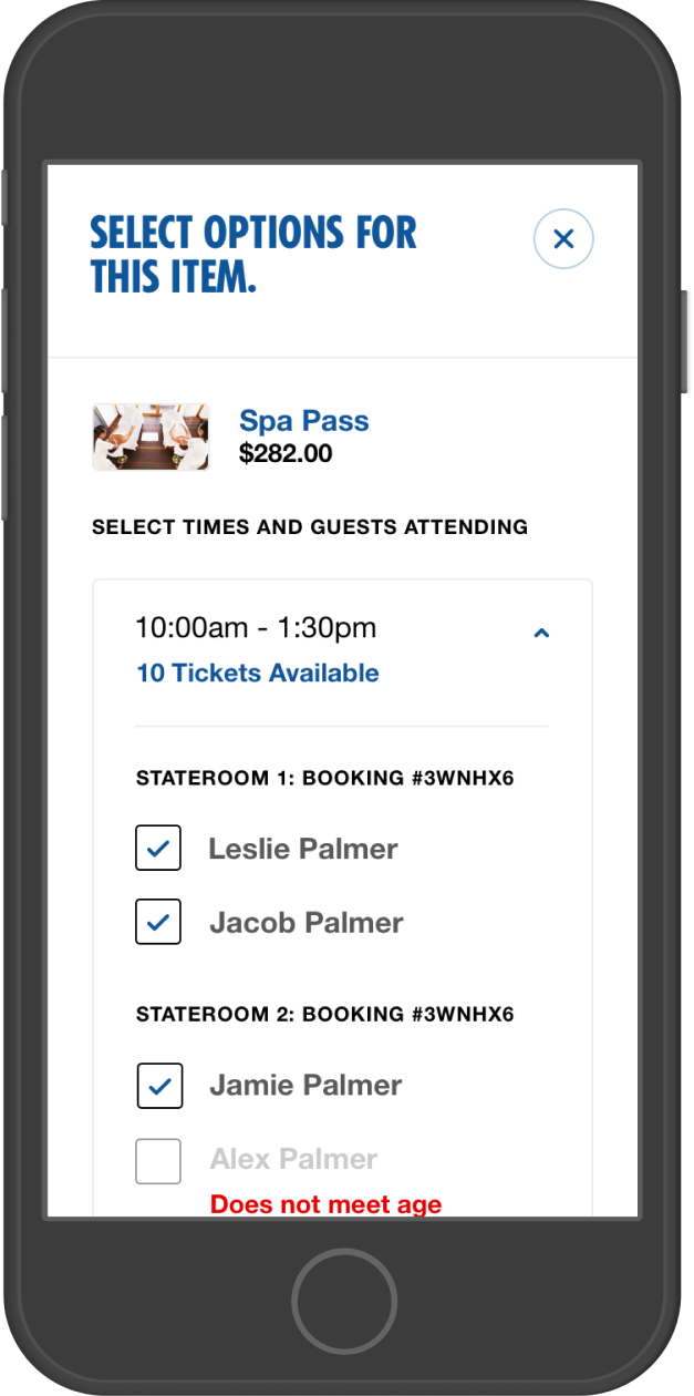
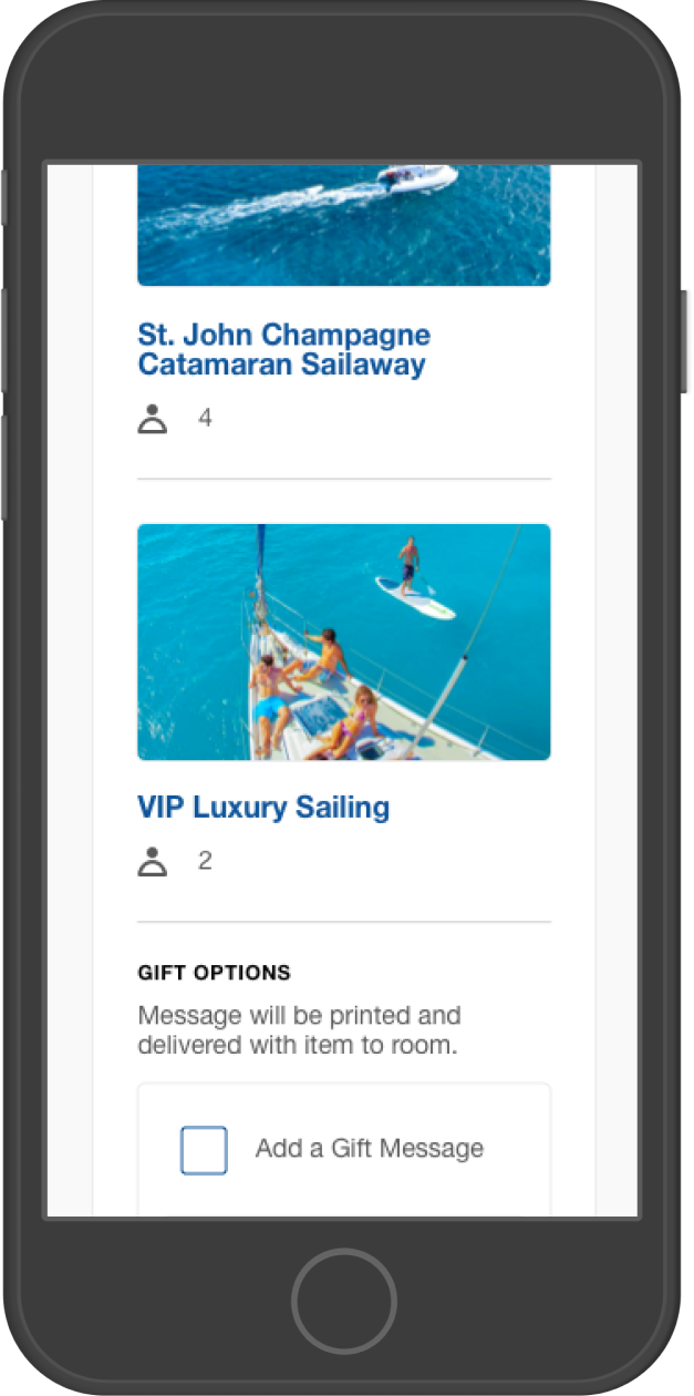
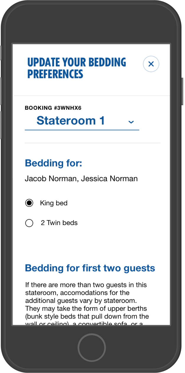
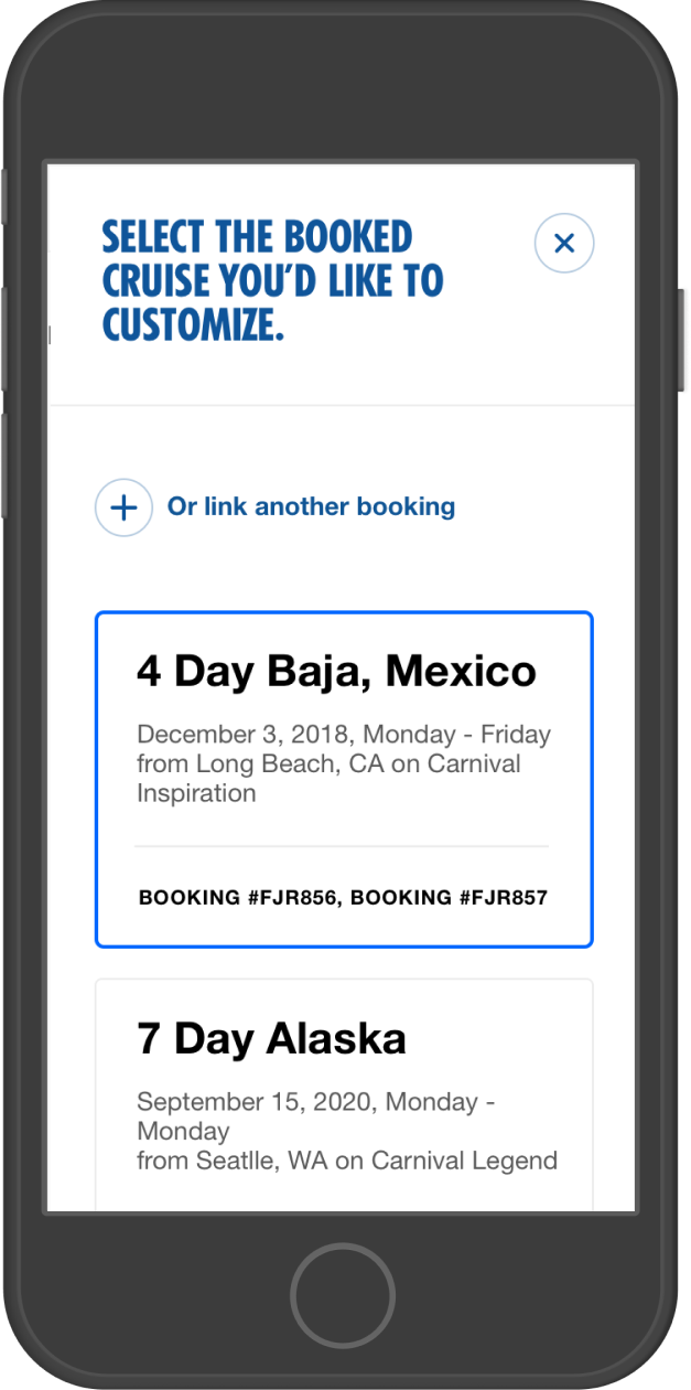
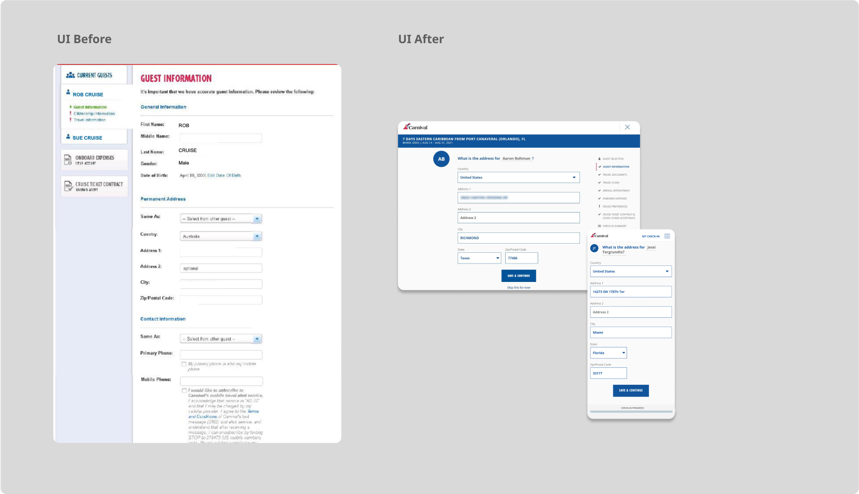
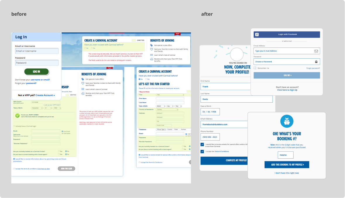
I’m a senior individual contributor designing enterprise systems where scale, constraints, and downstream impact matter. I work hands-on across workflows, information architecture, and interaction models—owning problems from framing through shipped UI.
I specialize in clarifying complex workflows, aligning cross-functional teams, and shaping intuitive interfaces that accelerate decision-making and adoption across diverse, global organizations.
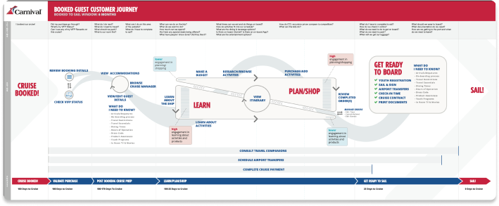
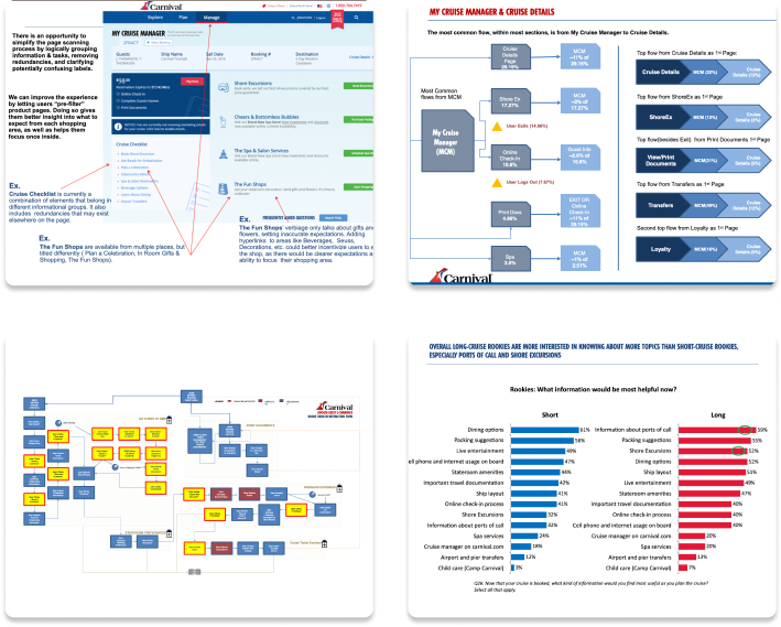
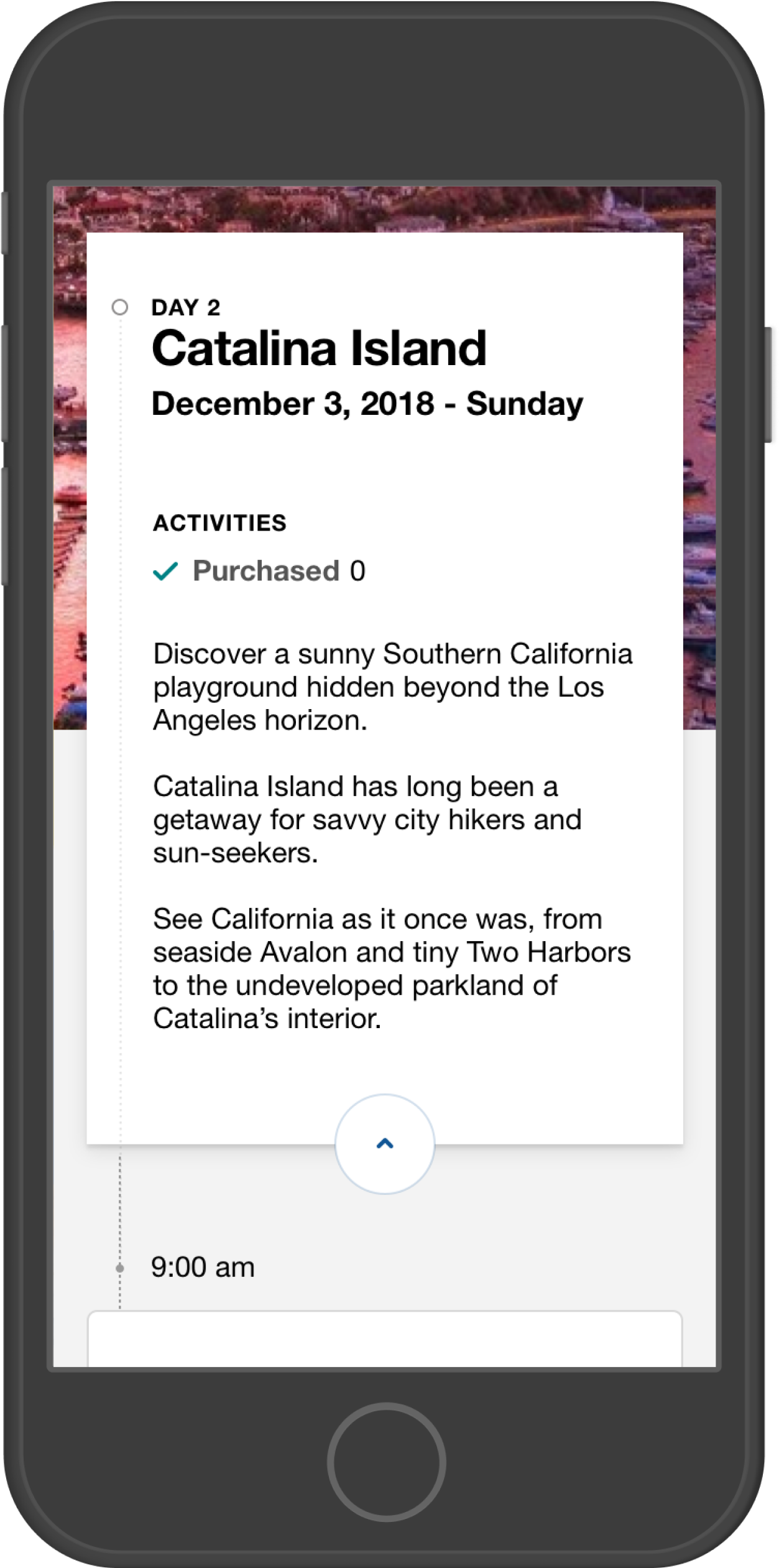
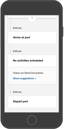
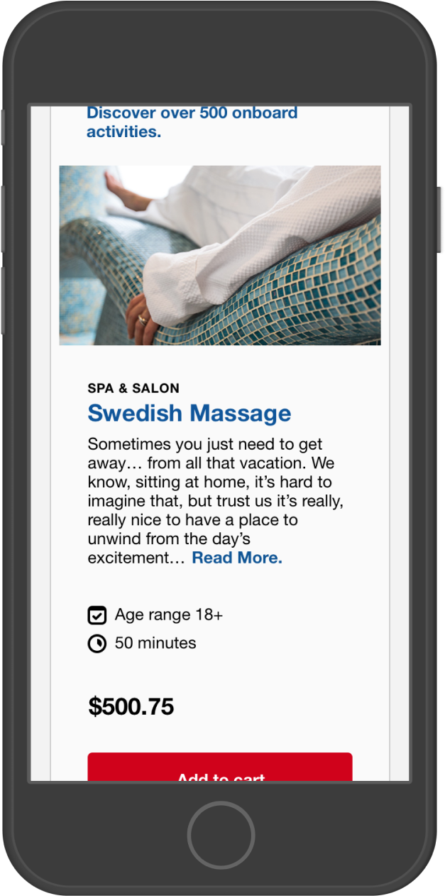
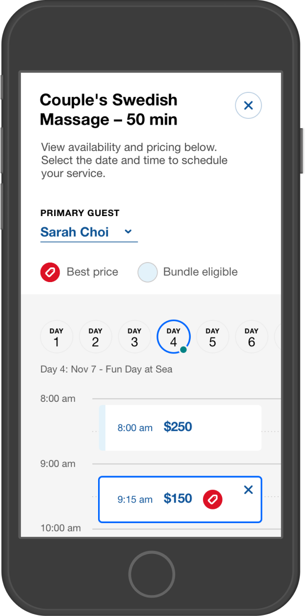
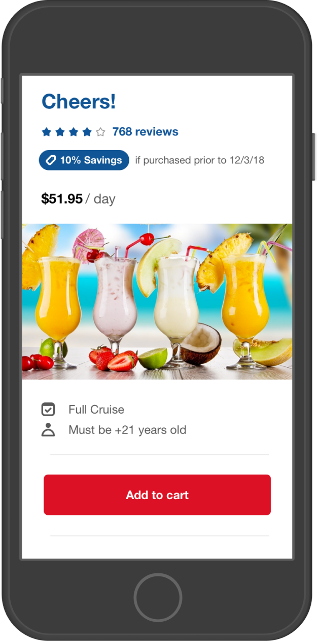
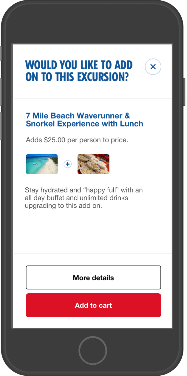
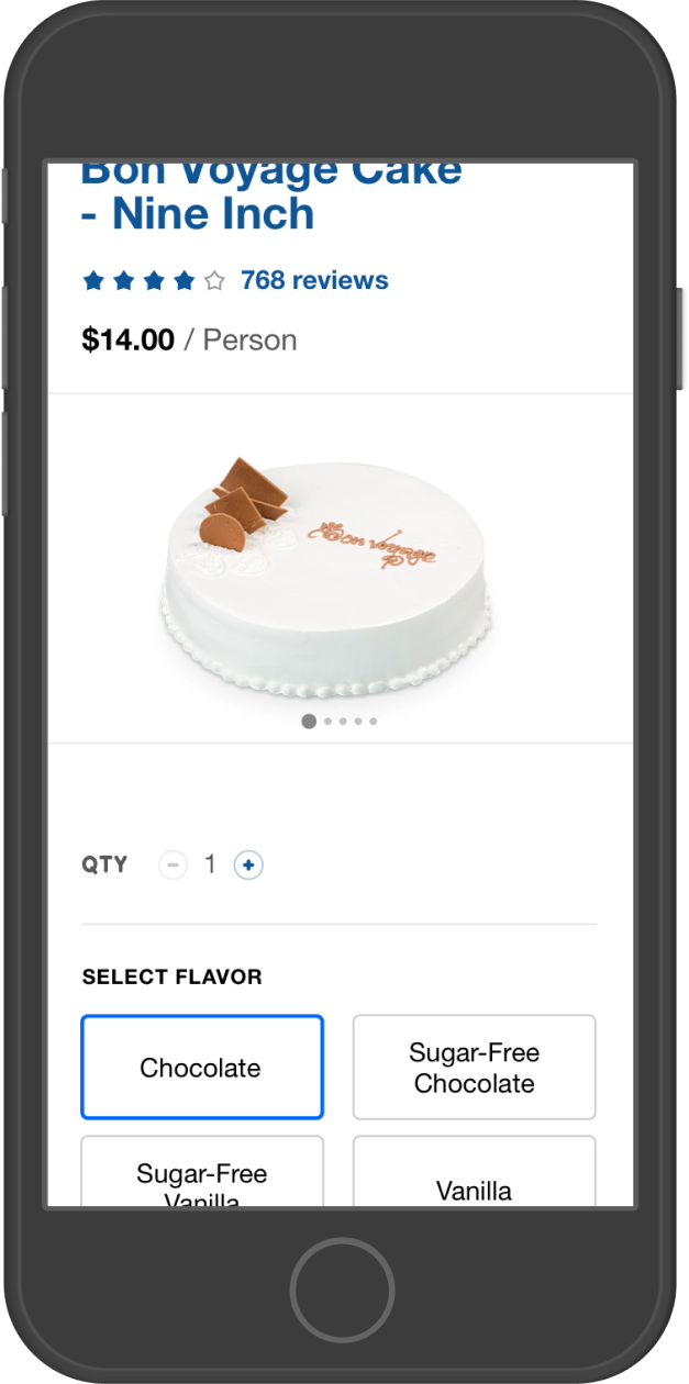
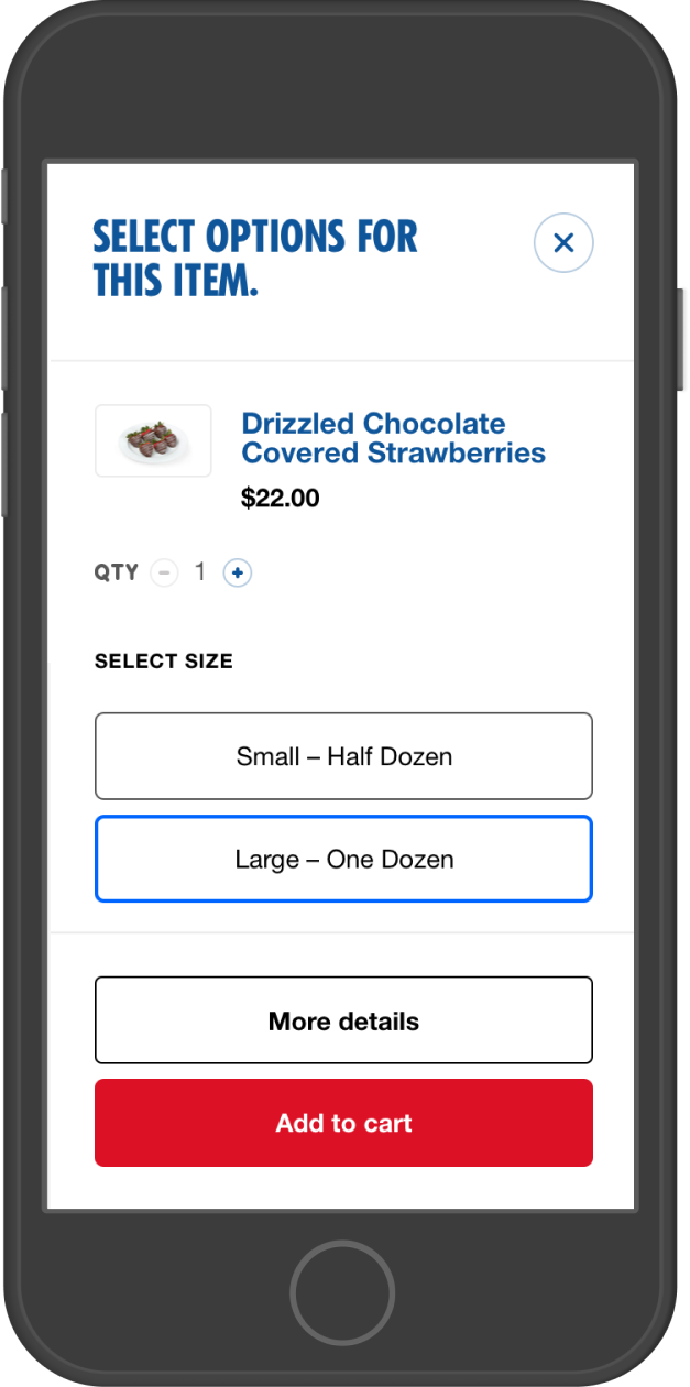
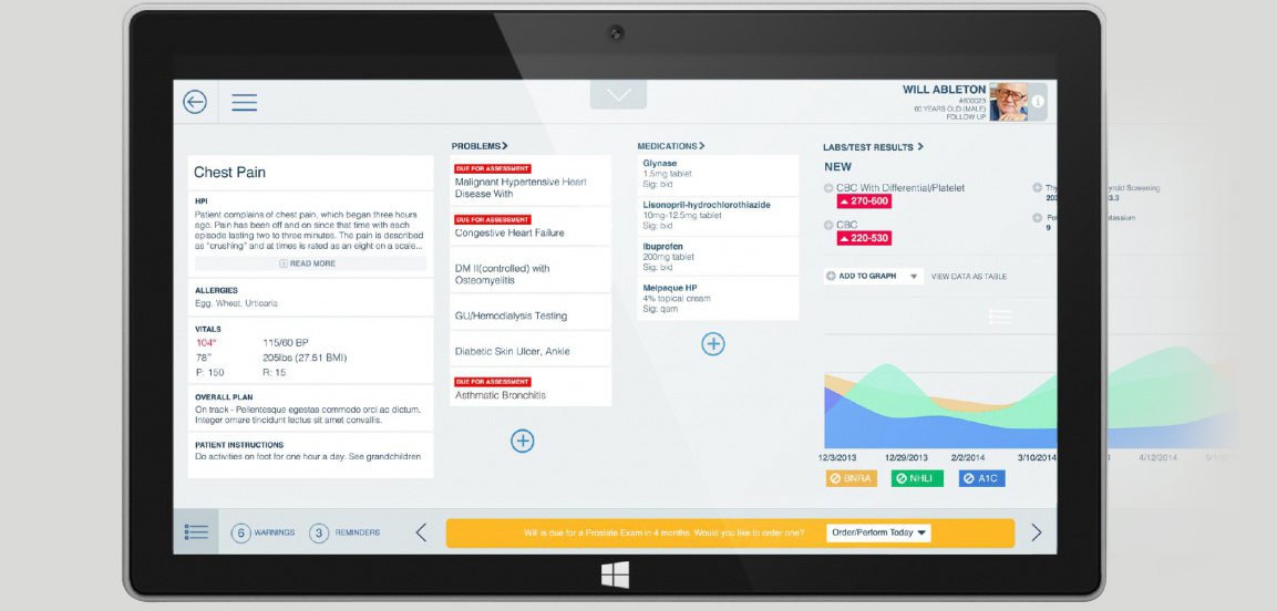
My work has supported e-commerce, travel, HR, healthcare, retail, and AI-powered automation—leading strategy, research, and design delivery across high-impact initiatives.
I’m a senior individual contributor designing enterprise systems where scale, constraints, and downstream impact matter. I work hands-on across workflows, information architecture, and interaction models—owning problems from framing through shipped UI.
I design with accessibility as a delivery constraint—keyboard-first interaction, readable hierarchy, clear states, and WCAG-aware patterns that engineers can implement.
I use AI as a force multiplier across research synthesis, concept generation, and content iteration — then apply product judgment to ship trustworthy experiences. My approach emphasizes human-in-the-loop control, explainability cues, and failure-state design so AI features are useful, safe, and adoption-ready.